From Nadia's drawing classes:
-3 perspectives from the pictures brought in, (1, 2, and 3 point)
-2 interior perspectives from dorm room (1, and 2 point)
-9 architectural hardware at 3 distances drawings (the ones from the lobby)
-house shadowing in perspective exercise
-light fixtures drawings
From Stoell's drafting classes:
-orthographic/ 3D shapes excercise
-2 plan/topographic drawings
-1 woodland chapel poche drafting
-1 Venturi House 1st floor drafting/lettering assignment (poche'd drawing)
-2 house elevation/ trees drawings (one without the trees for depth, and one with the trees)
-1 north arrow/scale exercise
-1 site plan drawing of home (from Google Earth)
Make sure to have all these items on your blog in some fashion as well. If you have any questions about these don't hesitate to ask. Also it will beneficial for you to include extra work you have done from this class (that was not in the previous portfolio check), as well as drawings from studio assignments. If you decide to do this be sure to make sure everything is organized properly.
Tuesday, December 2, 2008
Sunday, November 2, 2008
Keep things in perspective...
These are some pages from the book Vanishing Point by Jason Cheeseman-Meyer. It is an excellent resource for all things perspective. I would HIGHLY recommend you get this book for reference. I still go back to mine very regularly to check myself. It also has a great section on curvilinear perspective for when you progress to that level, very neat stuff. Anyway, awesome book, you all should get a copy, you won't regret it I promise
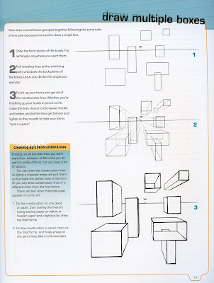 This page illustrates how to progress through a one point perspective drawing. First start with two dimensional shapes, then project lines to the vanishing point to create the sense of depth.
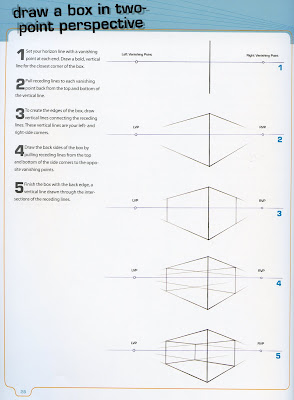 This page explains much of the same thing as the one above it, however it is in two point perspective.
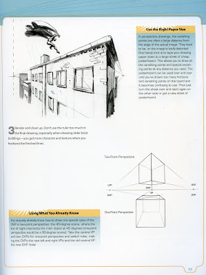 Not all great scenes or layouts need to be very complex, the image above shows this well. It has a very dynamic feel, despite being of simple construction. The lower image on the page presents the basic difference between one and two point perspectives.
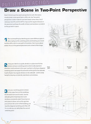
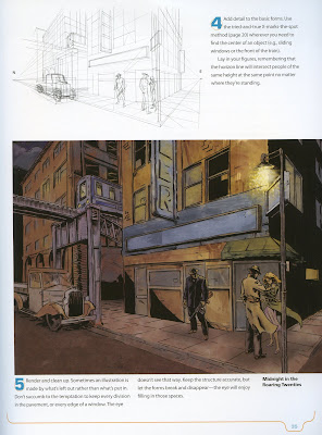 These two pages go through one approach for creating a scene in perspective. Again while the finished product is very appealing and daunting, the elemental construction of the scene is very basic. An example of this and a great source of inspiration can be found at Feng Zhu Designs, go to the gallery and check out the environments. They are an awesome example of what can be done with these simple tools.
It may seem difficult to grasp now, but perspective is the cornerstone of all drawing. If you master this, the effectiveness of your sketches and drawings will improve tenfold. Keep workin at it!
-kurt-
 This page illustrates how to progress through a one point perspective drawing. First start with two dimensional shapes, then project lines to the vanishing point to create the sense of depth.
 This page explains much of the same thing as the one above it, however it is in two point perspective.
 Not all great scenes or layouts need to be very complex, the image above shows this well. It has a very dynamic feel, despite being of simple construction. The lower image on the page presents the basic difference between one and two point perspectives.
 These two pages go through one approach for creating a scene in perspective. Again while the finished product is very appealing and daunting, the elemental construction of the scene is very basic. An example of this and a great source of inspiration can be found at Feng Zhu Designs, go to the gallery and check out the environments. They are an awesome example of what can be done with these simple tools.
It may seem difficult to grasp now, but perspective is the cornerstone of all drawing. If you master this, the effectiveness of your sketches and drawings will improve tenfold. Keep workin at it!
-kurt-
Friday, October 31, 2008
Powerpoint Mockup
Please note Monday, October 3rd each group needs to have a well-developed powerpoint presentation available for viewing in studio. This will allow us to give feedback and further assist everyone in the decisions and visualization needed for a successful presentation.
The work thus far is commendable, keep up the good work!
Wednesday, October 22, 2008
101 Things I learned in Architecture
Improved design process, not a perfectly realized building, is the most valuable thing you gain from one design studio and take with you to the next.
Design studio instructors, above all else, want their students to develop good process. If an instructor gives a good grade to what appears to you to be a poor project, it is probably because the student has demonstrated good process. Likewise, you may see an apparently good project receive a mediocre grade. Why? Because a project doesn't deserve a good grade if the process that led to it was sloppy, ill-structured, or the result of hit-and-miss good luck.
by Matthew Fredrick
Tuesday, October 14, 2008
READ BELOW
For those of you who still have not added the labels gadget in order to see your projects categorized by class, read the below post entitled Blog Labels. By labeling each post accordingly (e.g. iar101, iar110, etc) a more cohesive viewing and evaluation of your work can take place.
Friday, October 3, 2008
Unity Review
Just to reiterate what we discussed for Monday:
-name card for your model 3" x 1" Arial 18 font
-all drawings and graphics displayed in the crit room by 8:30am with your name and date incorporated in the overall graphic.
Most importantly you will not be verbally presenting your work, however, visual clarity among the group is a must. These projects need to express unity overall. This overall composition of work displayed by the class as a whole either takes everyone's work to the next level or a lower level. Talk to your peers and begin communicating as a group to achieve a successful visual presentation.
We look forward to seeing your work on monday!
Tuesday, September 30, 2008
Blog Labels
For all of you who are using labels when posting to your blogs: Be sure to add the gadget to your page. This will display a list of all the labels you have entered and allows everything under each category to be accessible simply by clicking the links that the gadget creates. Here is how to do it:
-After logging in, in the right top corner of your screen click customize,
-Click "add a gadget" from the list of page elements displayed(it will be at the top),
-scroll down until you get to the gadget that says "labels" and click the [+] button.
From here it is self explanatory. Then when you view your blog, this feature will appear with your profile, and archives. You will only have to do this once, and any subsequent label you employ will automatically be added to this list.
Subscribe to:
Comments (Atom)
